Hands-On Exercise for
Chapter 3
URL of
website: https://communitylibrarysedona.org/
Name of
website:community
library sedona
Target
Audience: Anyone
that likes to rent book or movies from a library
Screenshot
of the home page: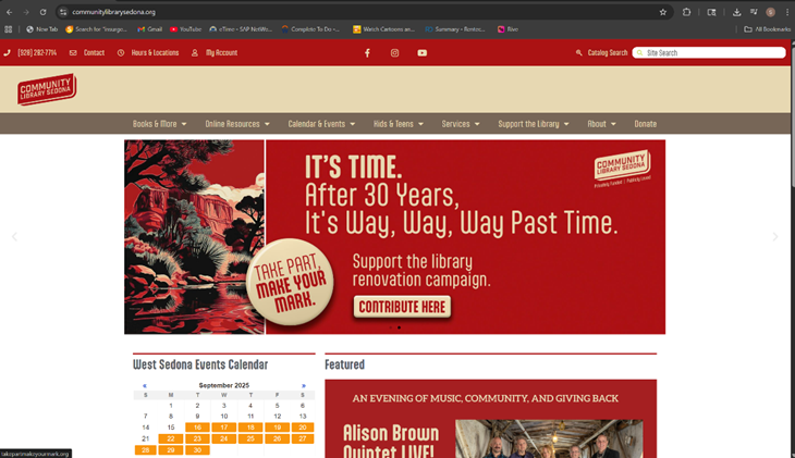
Types of
navigation evident:They
have a navigation bar at the top with their Contact info, Hours and Locations,
user account, other social media followings, a search field for catalog
searches, about section, donate section
Design
Principles of contrast, repetition alignment and proximity: Showing different things that are
going on with this library. Has a slide show that shows all the events that are
happening.It looks like a standard home page for a library.
Check
sheet:
1. X Consistent
site header/logo
□X 2.
Consistent navigation area
□X 3.
Informative page title that includes the company/organization/site name
□X 4.
Page footer area—copyright, last update, contact e-mail address
□X 5.
Good use of basic design principles: repetition, contrast, proximity, and
alignment
□X 6.
Balance of text/graphics/white space on page
□X 7.
Home page downloads within 10 seconds on a mobile device
□X 8.
Viewport meta tag is used to enhance display on smartphone
□X 9.
Responsive page layout is configured for smartphone and tablet display
Navigation
Criteria
□X 1.
Main navigation links are clearly and consistently labeled
□X 2.
Navigation is structured within an unordered list
□X 3.
When the main navigation consists of images and/or multimedia, the page footer
area contains plain text hyperlinks (accessibility)
□ 4.
Navigational aids, such as site map, skip to content link, or breadcrumbs, are
used
Color and
Graphics Criteria
□X 1.
Use of different colors is limited to a maximum of three or four plus neutrals
□X 2.
Color is used consistently
□X 3.
Background and text colors have good contrast
□X 4.
Color is not used alone to convey meaning (accessibility)
□X 5.
Use of color and graphics enhances rather than distracts from the site
□X 6.
Graphics are optimized and do not slow download significantly
□X 7.
Each graphic used serves a clear purpose
□X 8.
Image elements use the alt attribute to configure alternate text
(accessibility)
□X 9.
Animated images do not distract from the site and do not loop endlessly
Multimedia
Criteria
□ 1.
Each audio or video file used serves a clear purpose
□ 2.
The audio or video files used enhance rather than distract from the site
□ 3.
Captions or transcripts are provided for each audio or video file used
(accessibility)
□ 4.
The file size is indicated for audio and video downloads
Content
Presentation Criteria
□ 1.
Common fonts such as Arial or Times New Roman are used
□ 2.
Techniques of writing for the Web are applied: headings, subheadings, bulleted
lists, short sentences in brief paragraphs, use of empty space
□X 3.
Fonts, font sizes, and font colors are consistently used
□X 4.
Content provides meaningful, useful information
□X 5.
Content is organized in a consistent manner
□X 6.
Information is easy to find (minimal clicks)
□X 7.
Timeliness: The date of the last revision and/or copyright date is accurate
□X 8.
Content is free of typographical and grammatical errors
□X 9.
Avoids the use of “Click here” when writing text for hyperlinks
□X 10.
Hyperlinks use a consistent set of colors to indicate visited/nonvisited status
□ X11.
Alternate text equivalent of content is provided for graphics and media
(accessibility)
Functionality
Criteria
□X 1.
All internal hyperlinks work
□X 2.
All external hyperlinks work
□X 3.
All forms function as expected
□X 4.
No error messages are generated by the pages
Additional
Accessibility Criteria
□X 1.
Use attributes designed to improve accessibility such as alt and title where
appropriate
□X 2.
The html element’s lang attribute indicates the spoken language of the page
Browser
Compatibility Criteria
□X 1.
Displays on current versions of Edge, Internet Explorer, Firefox, Safari,
Chrome, and Opera
□X 2.
Displays on popular mobile devices (including tablets and smartphones)
Recommendations:
Maybe more pictures.