Hands-On Exercise for
Chapter 3
URL of
website: https://www.bostonglobe.com/
Name of
website: The Boston
Globe
Target
Audience: Local/Regional
people in Boston and New England. As well as international people.
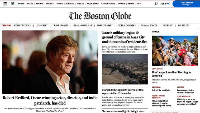
Screenshot
of the home page:
Types of
navigation evident: Navigation
bar at the top, Trending stories below the Header, and a “Most Read” section on
the right.
Design
Principles of contrast, repetition, alignment, and proximity: Dark text on white background,
large/bold headlines, same font styles, consistent placement of their logo and
the navigation bar, related stories are grouped together, and footer links are
organized in columns.
Check
sheet:
□ X 1. Consistent site header/logo
□ X 2.
Consistent navigation area
□ X 3.
Informative page title that includes the company/organization/site name
□ X 4.
Page footer area—copyright, last update, contact e-mail address
□ X 5.
Good use of basic design principles: repetition, contrast, proximity, and
alignment
□ X 6.
Balance of text/graphics/white space on page
□ X 7.
Home page downloads within 10 seconds on a mobile device
□ 8.
Viewport meta tag is used to enhance display on smartphone
□ X 9.
Responsive page layout is configured for smartphone and tablet display
Navigation
Criteria:
□ X 1.
Main navigation links are clearly and consistently labeled
□ 2.
Navigation is structured within an unordered list
□ 3. When
the main navigation consists of images and/or multimedia, the page footer area
contains plain text hyperlinks (accessibility)
□ X 4.
Navigational aids, such as site map, skip to content link, or breadcrumbs, are
used
Color and
Graphics Criteria:
□ X 1.
Use of different colors is limited to a maximum of three or four plus neutrals
□ X 2.
Color is used consistently
□ X 3.
Background and text colors have good contrast
□ X 4.
Color is not used alone to convey meaning (accessibility)
□ X 5.
Use of color and graphics enhances rather than distracts from the site
□ X 6.
Graphics are optimized and do not slow download significantly
□ X 7.
Each graphic used serves a clear purpose
□ 8. Image
elements use the alt attribute to configure alternate text (accessibility)
□ X 9.
Animated images do not distract from the site and do not loop endlessly
Multimedia
Criteria:
□ X 1. Each audio or video file used serves a clear purpose
□ X 2. The audio or video files used enhance rather than
distract from the site
□ 3.
Captions or transcripts are provided for each audio or video file used
(accessibility)
□ 4. The
file size is indicated for audio and video downloads
Content
Presentation Criteria:
□ X 1.
Common fonts such as Arial or Times New Roman are used
□ X 2.
Techniques of writing for the Web are applied: headings, subheadings, bulleted
lists, short sentences in brief paragraphs, use of empty space
□ X 3.
Fonts, font sizes, and font colors are consistently used
□ X 4.
Content provides meaningful, useful information
□ X 5.
Content is organized in a consistent manner
□ X 6.
Information is easy to find (minimal clicks)
□ X 7.
Timeliness: The date of the last revision and/or copyright date is accurate
□ X 8.
Content is free of typographical and grammatical errors
□ X 9.
Avoids the use of “Click here” when writing text for hyperlinks
□ X 10.
Hyperlinks use a consistent set of colors to indicate visited/nonvisited status
□ 11.
Alternate text equivalent of content is provided for graphics and media
(accessibility)
Functionality
Criteria:
□ X 1.
All internal hyperlinks work
□ X 2.
All external hyperlinks work
□ X 3.
All forms function as expected
□ X 4.
No error messages are generated by the pages
Additional
Accessibility Criteria:
□ X 1.
Use attributes designed to improve accessibility such as alt and title where
appropriate
□ X 2.
The html element’s lang attribute indicates the spoken language of the page
Browser
Compatibility Criteria:
□ X 1.
Displays on current versions of Edge, Internet Explorer, Firefox, Safari,
Chrome, and Opera
□ X 2.
Displays on popular mobile devices (including tablets and smartphones)
Recommendations:
-
No
ads. They can get annoying when they randomly pop up while you’re scrolling
down the page.
-
Organize
the top half better. Further down the page, things are broken up into “More
Recent News,” “Recommended Reads,” “Culture & Lifestyle,” etc. I feel that
it should be more organized like that, straight away at the top.