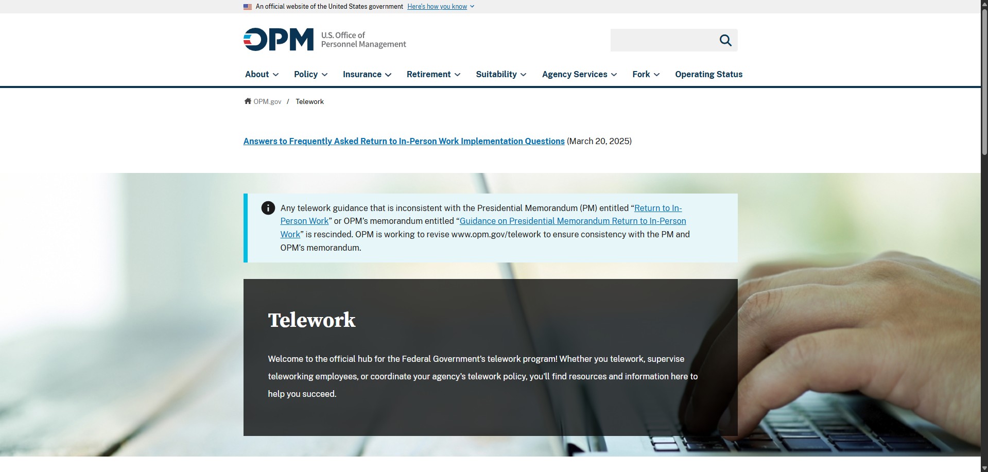
For this exercise, I will be reviewing this webpage to see if it follows proper design standards. The checklist I'll be refrencing for this can be found in Chapter 3 of Basics of Web Design: HTML5 & CSS by Terry Felke-Morris.

Overall, this is a very simple but well designed page that does what it needs to. It's a US government Web page that provides information to anyone involved in telework as their profession. Navigation elements are consistant, and go to relevant pages when you click on them. Everything is middle-aligned, making the viewing experience easier for the user. Since it is a US Government website, contact information varies. For the small header at the top, it's a reassurance for the user so they know they are on an official US Government Web page. All of the text is easily viewable, with good contrast practices being used-dark text on light background. There are no videos, making the page easily loadable no matter the user's connection speed. This is a good Web page by design. I have no recommendations as it does exactly what it needs to.