Hands-On Exercise for
Chapter 3
URL of
website: https://en.wikipedia.org/wiki/Main_Page
Name of
website: English Wikipedia
Target
Audience: None in particular; or rather, anyone seeking freely available
information on an enormous range of topics
Screenshot
of the home page:
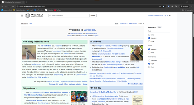
Types of
navigation evident:
·
The
Wikipedia logo and link to the main page on the top left, along with expandable
side bar (hamburger menu)
·
Search
bar at the top-center
·
Options
at top-right to donate, create account, or log in
·
Link
to today’s featured article and recently featured articles
·
“In
the news” section with link to ongoing events and recent deaths
·
“Did
you know…” section with links
·
“On
this day” with links to events, birthdays, and deaths that occurred on today’s
date
·
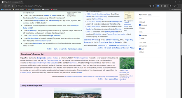
“From
today’s featured list” and “Today’s featured picture” sections with links to
associated articles
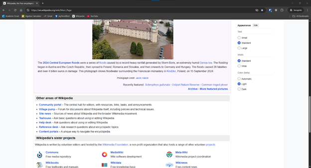
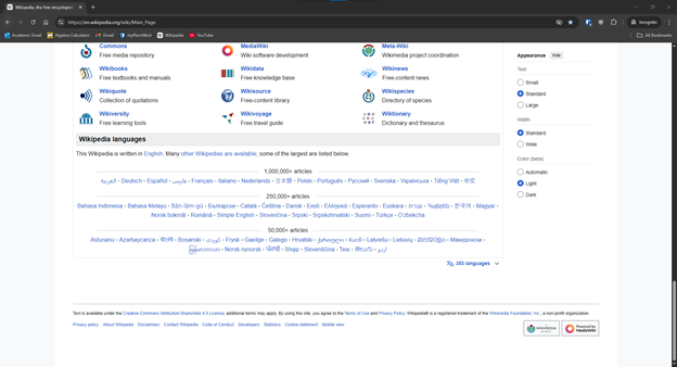
·
Section
with links to other areas of the site, sister projects, and other language
versions
·
Footer
with links to privacy policy, about page, contact, etc.
Design
Principles of contrast, repetition, alignment, and proximity:
·
Contrast:
o
Dark
text on a light background (by default, dark mode inverts this)
o
Backgrounds
of the headers of highlighted sections are colored (Green on the left, blue on
the right)
o
Links
are clearly colored blue, with bold text indicating highlighting keywords
·
Repetition:
o
Consistent
use of font types
o
Consistent
layout of sections: (From the top) Heading, content, links
·
Alignment:
o
Grid
layout arranged in columns
o
Text
is left-aligned throughout
o
Images
generally placed to the left or right of bodies of text
o
Navigation
elements aligned horizontally at the top of the page
·
Proximity:
o
Related
items are grouped together, such as the news
o
Sections
are separated by white space, but not an excessive amount
o
Headings
and body content are close together, making it clear to users that they are
associated
Check sheet:
1.
Consistent site header/logo
☑ 2. Consistent navigation area
☑ 3. Informative page title that
includes the company/organization/site name
☑ 4. Page footer area—copyright,
last update, contact e-mail address
☑ 5. Good use of basic design
principles: repetition, contrast, proximity, and alignment
☑ 6. Balance of
text/graphics/white space on page
☑ 7. Home page downloads within
10 seconds on a mobile device
☑ 8. Viewport meta tag is used
to enhance display on smartphone
☑ 9. Responsive page layout is
configured for smartphone and tablet display
Navigation
Criteria
☑ 1. Main navigation links are
clearly and consistently labeled
☑ 2. Navigation is structured
within an unordered list
□ 3.
When the main navigation consists of images and/or multimedia, the page footer
area contains plain text hyperlinks (accessibility)
☑ 4. Navigational aids, such as
site map, skip to content link, or breadcrumbs, are used
Color and
Graphics Criteria
☑ 1. Use of different colors is
limited to a maximum of three or four plus neutrals
☑ 2. Color is used consistently
☑ 3. Background and text colors
have good contrast
☑ 4. Color is not used alone to
convey meaning (accessibility)
☑ 5. Use of color and graphics
enhances rather than distracts from the site
☑ 6. Graphics are optimized and
do not slow download significantly
☑ 7. Each graphic used serves a
clear purpose
☑ 8. Image elements use the alt
attribute to configure alternate text (accessibility)
☑ 9. Animated images do not
distract from the site and do not loop endlessly
Multimedia
Criteria
☑ 1. Each audio or video file
used serves a clear purpose
☑ 2. The audio or video files
used enhance rather than distract from the site
☑ 3. Captions or transcripts are
provided for each audio or video file used (accessibility)
☑ 4. The file size is indicated
for audio and video downloads
Content
Presentation Criteria
☑ 1. Common fonts such as Arial
or Times New Roman are used
☑ 2. Techniques of writing for
the Web are applied: headings, subheadings, bulleted
lists, short sentences in brief paragraphs, use of empty space
☑ 3. Fonts, font sizes, and font
colors are consistently used
☑ 4. Content provides
meaningful, useful information
☑ 5. Content is organized in a
consistent manner
☑ 6. Information is easy to find
(minimal clicks)
☑ 7. Timeliness: The date of the
last revision and/or copyright date is accurate
☑ 8. Content is free of
typographical and grammatical errors
☑ 9. Avoids the use of “Click
here” when writing text for hyperlinks
□ 10.
Hyperlinks use a consistent set of colors to indicate visited/nonvisited status
☑ 11. Alternate text equivalent
of content is provided for graphics and media (accessibility)
Functionality
Criteria
☑ 1. All internal hyperlinks
work
☑ 2. All external hyperlinks
work
☑ 3. All forms function as
expected
☑ 4. No error messages are
generated by the pages
Additional
Accessibility Criteria
☑ 1. Use attributes designed to
improve accessibility such as alt and title where appropriate
☑ 2. The html element’s lang
attribute indicates the spoken language of the page
Browser
Compatibility Criteria
☑ 1. Displays on current
versions of Edge, Internet Explorer, Firefox, Safari, Chrome, and Opera
☑ 2. Displays on popular mobile
devices (including tablets and smartphones)
Recommendations:
If I were to
recommend anything, it would likely be more customization options for users,
plus maybe some personalization of the main page. Collapsable section summaries
at the top of long articles could be useful.
But
Wikipedia has very strict accessibility guidelines, and the classic Web 2.0
style is very responsive. Even on mobile the main page loads in less than a
second.