Hands-On Exercise for Chapter 3
URL of website: https://www.nationalgeographic.com/
Name of website: National Geographic
Target Audience: People interested in science, history, nature, exploration, photography and culture. These people include students, researchers, educators, and general readers who want high quality and visually engaging information.
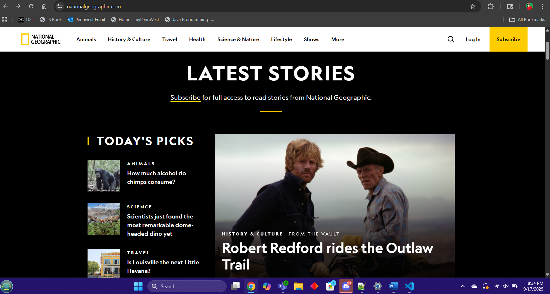
Screenshot of the home page:
Types of navigation evident: Top navigation bar, dropdown menus, search bar, footer links
Design Principles of contrast, repetition alignment and proximity:
Contrast: Strong contrast between text and background, Images are vibrant, organized and stand out.
Repetition: Fonts and color schemes are consistent along with the layout of the site and its pages.
Alignment: Content is grid based with clean left to right alignment, structuring the layout of the website.
Proximity: Related content is grouped accordingly which helps readers quickly find what they need.
Check sheet:
Y = Yes | N = No
- Y □ 1. Consistent site header/logo
- Y □ 2. Consistent navigation area
- Y □ 3. Informative page title that includes the company/organization/site name
- Y □ 4. Page footer area—copyright, last update, contact e-mail address
- Y □ 5. Good use of basic design principles: repetition, contrast, proximity, and alignment
- Y □ 6. Balance of text/graphics/white space on page
- Y □ 7. Home page downloads within 10 seconds on a mobile device
- Y □ 8. Viewport meta tag is used to enhance display on smartphone
- Y □ 9. Responsive page layout is configured for smartphone and tablet display
Navigation Criteria
- Y □ 1. Main navigation links are clearly and consistently labeled
- Y □ 2. Navigation is structured within an unordered list
- Y □ 3. When the main navigation consists of images and/or multimedia, the page footer area contains plain text hyperlinks (accessibility)
- Y □ 4. Navigational aids, such as site map, skip to content link, or breadcrumbs, are used
Color and Graphics Criteria
- Y □ 1. Use of different colors is limited to a maximum of three or four plus neutrals
- Y □ 2. Color is used consistently
- Y □ 3. Background and text colors have good contrast
- Y □ 4. Color is not used alone to convey meaning (accessibility)
- Y □ 5. Use of color and graphics enhances rather than distracts from the site
- Y □ 6. Graphics are optimized and do not slow download significantly
- Y □ 7. Each graphic used serves a clear purpose
- Y □ 8. Image elements use the alt attribute to configure alternate text (accessibility)
- Y □ 9. Animated images do not distract from the site and do not loop endlessly
Multimedia Criteria
- Y □ 1. Each audio or video file used serves a clear purpose
- Y □ 2. The audio or video files used enhance rather than distract from the site
- Y □ 3. Captions or transcripts are provided for each audio or video file used (accessibility)
- Y □ 4. The file size is indicated for audio and video downloads
Content Presentation Criteria
- Y □ 1. Common fonts such as Arial or Times New Roman are used
- Y □ 2. Techniques of writing for the Web are applied: headings, subheadings, bulleted lists, short sentences in brief paragraphs, use of empty space
- Y □ 3. Fonts, font sizes, and font colors are consistently used
- Y □ 4. Content provides meaningful, useful information
- Y □ 5. Content is organized in a consistent manner
- Y □ 6. Information is easy to find (minimal clicks)
- Y □ 7. Timeliness: The date of the last revision and/or copyright date is accurate
- Y □ 8. Content is free of typographical and grammatical errors
- Y □ 9. Avoids the use of “Click here” when writing text for hyperlinks
- Y □ 10. Hyperlinks use a consistent set of colors to indicate visited/nonvisited status
- Y □ 11. Alternate text equivalent of content is provided for graphics and media (accessibility)
Functionality Criteria
- Y □ 1. All internal hyperlinks work
- Y □ 2. All external hyperlinks work
- Y □ 3. All forms function as expected
- Y □ 4. No error messages are generated by the pages
Additional Accessibility Criteria
- Y □ 1. Use attributes designed to improve accessibility such as alt and title where appropriate
- Y □ 2. The html element’s lang attribute indicates the spoken language of the page
Browser Compatibility Criteria
- Y □ 1. Displays on current versions of Edge, Internet Explorer, Firefox, Safari, Chrome, and Opera
- Y □ 2. Displays on popular mobile devices (including tablets and smartphones)
Recommendations:
- Increase accessibility: While alt text is present on many images, ensuring all decorative and informative images have meaningful alt text would improve inclusivity.
- Simplify navigation on mobile: The mobile hamburger menu has many subcategories, which could overwhelm new users. A more streamlined mobile menu could help.
- Improve multimedia accessibility: While captions exist, transcripts for all videos would better support users with hearing impairments.
- Optimize ad placement: Some pages contain large ads that can distract from content. Balancing ads with user experience could improve readability.
- Speed optimization: Although the site is fairly fast, compressing larger images and videos further could make mobile and outdated system loading even quicker.