Jonathan Kennedy
Intro to Website Development
Hands-On Exercise for Chapter 3
URL of website: Motion
Twin
Name of website: Motion Twin
Target Audience: Users looking for information on the Company Motion Twin & the video games they’ve developed
Screenshot of the home page: 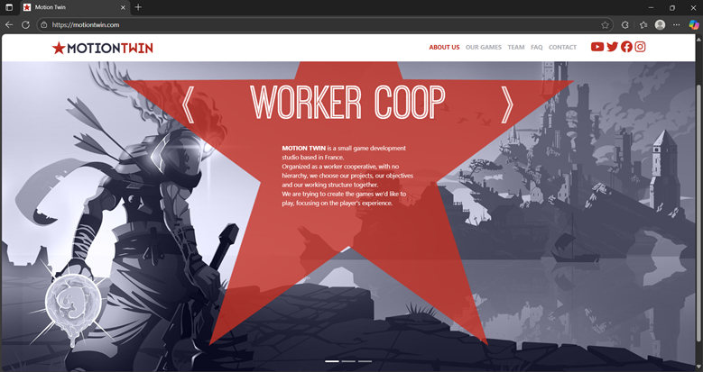
Note: The home page is animated, this is the first image
in the rotation
Types of navigation evident: Navbar
Design Principles of contrast, repetition alignment and proximity
Check sheet:
1. Consistent site header/logo
□ 2. Consistent navigation area Yes
□ 3. Informative page title that includes the
company/organization/site name Yes
□ 4. Page footer area—copyright, last update,
contact e-mail address Yes & No. They have copyright but not the contact
information (maybe because they have a separate page with contacts). They also
don’t have the latest update for copyright info.
□ 5. Good use of basic design principles:
repetition, contrast, proximity, and alignment Yes, especially since they
contrast colors on a white/light background
□ 6. Balance of text/graphics/white space on
page Yes, particularly when it comes to the margins (which result in a
reasonable amount of whitespace)
□ 7. Home page downloads within 10 seconds on a mobile device
□ 8. Viewport meta tag is used to enhance
display on smartphone Yes
□ 9. Responsive page layout is configured for
smartphone and tablet display Yes
Navigation Criteria
□ 1. Main navigation links are clearly and
consistently labeled Yes
□ 2. Navigation is structured within an
unordered list Yes
□ 3. When the main navigation consists of images
and/or multimedia, the page footer area contains plain text hyperlinks
(accessibility) No* (Not applicable; “doesn’t use this”)
□ 4. Navigational aids, such as site map, skip to content link, or breadcrumbs, are used
Color and Graphics Criteria No
□ 1. Use of different colors is limited to a
maximum of three or four plus neutrals Yes
□ 2. Color is used consistently Yes
□ 3. Background and text colors have good contrast Yes
□ 4. Color is not used alone to convey meaning
(accessibility) Yes
□ 5. Use of color and graphics enhances rather
than distracts from the site Yes
□ 6. Graphics are optimized and do not slow download significantly
□ 7. Each graphic used serves a clear purpose Yes
□ 8. Image elements use the alt attribute to
configure alternate text (accessibility) No
□ 9. Animated images do not distract from the
site and do not loop endlessly Yes
Multimedia Criteria
*There appears to be no audio/videos on this page. However, the pages they
link to for their respective games do have audio, but I am not including
those since they’re a totally separate url (“Motion
Twin” vs “Dead Cells” for example)
□ 1. Each audio or video file used serves a
clear purpose No (No videos/audio on the site)
□ 2. The audio or video files used enhance rather than distract from the site No (No videos/audio on the site)
□ 3. Captions or transcripts are provided for each audio or video file used (accessibility) No (No videos/audio on the site)
□ 4. The file size is indicated for audio and video downloads No (No videos/audio on the site)
Content Presentation Criteria
□ 1. Common fonts such as Arial or Times New
Roman are used No, the font appears to be some form of “Segoe”
□ 2. Techniques of writing for the Web are
applied: headings, subheadings, bulleted lists, short
sentences in brief paragraphs, use of empty space Yes
□ 3. Fonts, font sizes, and font colors are
consistently used Yes
□ 4. Content provides meaningful, useful
information Yes (and some humor too)
□ 5. Content is organized in a consistent manner
Yes
□ 6. Information is easy to find (minimal
clicks) Yes
□ 7. Timeliness: The date of the last revision
and/or copyright date is accurate No – None are present
□ 8. Content is free of typographical and
grammatical errors Yes* (to be fair they do blatantly mention that you can
ask them to fix them if they’re present in their faq)
□ 9. Avoids the use of “Click here” when writing
text for hyperlinks Yes
□ 10. Hyperlinks use a consistent set of colors
to indicate visited/nonvisited status No (one
hyperlink didn’t change colors)
□ 11. Alternate text equivalent of content is
provided for graphics and media (accessibility) No
Functionality Criteria
□ 1. All internal hyperlinks work Yes
□ 2. All external hyperlinks work Yes
□ 3. All forms function as expected No (the
page has none)
□ 4. No error messages are generated by the
pages Yes
Additional Accessibility Criteria
□ 1. Use attributes designed to improve
accessibility such as alt and title where appropriate No – missing alt
attributes
□ 2. The html element’s lang attribute indicates
the spoken language of the page Yes
Browser Compatibility Criteria
□ 1. Displays on current versions of Edge,
Internet Explorer, Firefox, Safari, Chrome, and Opera Yes
□ 2. Displays on popular mobile devices
(including tablets and smartphones) Yes
Recommendations:
- Update copyright info (unless I am missing something here
- Consider adding audio to improve the “liveliness” of the page
- Add alt attributes & other similar features to the page in order to improve accessibility