Hands-On Exercise for
Chapter 3
URL of website:
https://www.remedygames.com/
-This is the homepage for “Remedy Entertainment”, a video game development
studio.
Name of
website: Remedy
Games
Target
Audience: “People
who play video games”, alongside those interested in learning about the games
they develop.
-Generally speaking, it’d likely be more focused on a young to middle age adult age range.
Screenshot of the
home page:
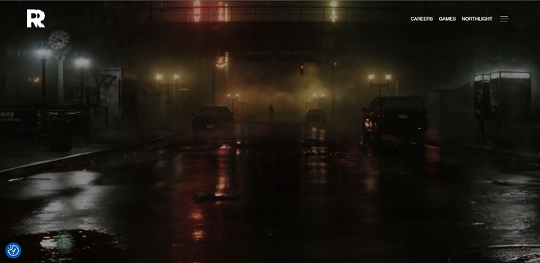
-It has a “movie” or “GIF” playing that cycles through different scenes from
their games.
Types of
navigation evident:
-It has a horizontal navigation bar at the top for the general categories. Upon
click the triple lines, it brings up additional
categories/sections that one can visit on the site (and that part is more
organized in a vertical manner).
Design Principles of
contrast, repetition alignment and proximity:
-It has a consistent navigation bar.
-The site primarily has a black/dark background, of which it then typically
uses red/white text to contrast with said background.
-Displays the games they have published upfront on the homepage (via the
GIF/Short video)
-Overall consistent theme/styling of the pages on the website.
-Overall trying to reflect the attitude of the company by having a website that
displays their creativity.
Check sheet:
1.
Consistent site header/logo - YES
2. Consistent navigation area - YES
3.
Informative page title that includes the company/organization/site name -NO
(Had to look in address bar for site name)
4. Page
footer area—copyright, last update, contact e-mail address - YES
5. Good use
of basic design principles: repetition, contrast, proximity, and alignment -
YES
6. Balance
of text/graphics/white space on page - YES
7. Home page
downloads within 10 seconds on a mobile device - YES
8. Viewport
meta tag is used to enhance display on smartphone - YES
9.
Responsive page layout is configured for smartphone and tablet display - YES
Navigation Criteria
1. Main
navigation links are clear and consistently labeled - YES
2.
Navigation is structured within an unordered list – YES (If you press the
triple dashes)
3. When the
main navigation consists of images and/or multimedia, the page footer area
contains plain text hyperlinks (accessibility) - YES
4.
Navigational aids, such as site map, skip to content link, or
breadcrumbs, are used - YES
Color and Graphics Criteria
1. Use of
different colors is limited to a maximum of three or four plus neutrals -
YES
2. Color is
used consistently - YES
3.
Background and text colors have good contrast - YES
4. Color is
not used alone to convey meaning (accessibility) - YES
5. Use of
color and graphics enhances rather than distracts from the site - YES
6. Graphics
are optimized and do not slow download significantly - YES
7. Each
graphic used serves a clear purpose - YES
8. Image
elements use the alt attribute to configure alternate text (accessibility) – NO
(However most images aren’t images, but rather buttons)
9. Animated
images do not distract from the site and do not loop endlessly – NO (They
aren’t distracting, but rather the animated images do loop endlessly with a
delay)
Multimedia
Criteria
1. Each
audio or video file used serves a clear purpose - NO
2. The audio
or video files used enhance rather than distract from the site - NO
3. Captions
or transcripts are provided for each audio or video file used (accessibility) -
NO
4. The file
size is indicated for audio and video downloads – NO
NOTE: There are no embedded videos on the page. At most there’s GIF’s /
embedded YouTube links. (There are no mp3/mp4 embeds).
Content
Presentation Criteria
1. Common
fonts such as Arial or Times New Roman are used - NO
2.
Techniques of writing for the Web are applied: headings, subheadings, bulleted
lists, short sentences in brief paragraphs, use of empty space - YES
3. Fonts,
font sizes, and font colors are consistently used - YES
4. Content
provides meaningful, useful information - YES
5. Content
is organized in a consistent manner - YES
6.
Information is easy to find (minimal clicks) - YES
7.
Timeliness: The date of the last revision and/or copyright date is accurate - YES
8. Content
is free of typographical and grammatical errors - YES
9. Avoids
the use of “Click here” when writing text for hyperlinks - YES
10.
Hyperlinks use a consistent set of colors to indicate visited/nonvisited status - NO
11.
Alternate text equivalent of content is provided for graphics and media
(accessibility) - NO
Functionality
Criteria
1. All
internal hyperlinks work - YES
2. All
external hyperlinks work - YES
3. All forms
function as expected - YES
4. No error
messages are generated by the pages - YES
Additional
Accessibility Criteria
1. Use
attributes designed to improve accessibility such as alt and title where
appropriate – NO (alt attribute isn’t used on the images that I was able to
find (the issue is that most are buttons and not images.))
2. The html
element’s lang attribute indicates the spoken language of the page - YES
Browser
Compatibility Criteria
1. Displays
on current versions of Edge, Internet Explorer, Firefox, Safari, Chrome, and
Opera - YES
2. Displays
on popular mobile devices (including tablets and smartphones) – YES (Works
on my laptop, desktop, tablet, and phone.)
Recommendations:
-Overall it is a
very well formatted website, however the most common issue was that there seemed
to be a lack of using the “alt” attribute to describe images for text readers.
While not strictly needed, they should probably add it in (even for the buttons
if possible).
-When it comes to the text on the website, my only real gripe is that when they
underline some parts text, it can look odd as they don’t underline the entire
word. (This is most notably seen in the “mission statement” that you see when
scrolling down on the homepage.) It may just be better to underline the entire
word/not underline it at all.
-The formatting on the “mission statement”
also looks slightly off, so it may need changed.
-This page lacks a distinct title,
seemingly rely on people knowing what/who the site is for. They should probably
add in the full company name somewhere, so people know the name of the site/the
focus of the site.
-The Animation/GIF/Whatever it is on the homepage can have a slight delay in
loading. (aka the page loads everything but that when you first load the page).
While this is good practice, they may want to improve its loading time as it
can lead to the animation being easily missed.
-There’s enough time that I could go
to a different page before it loads.